Modular Checkout
Modular Checkout
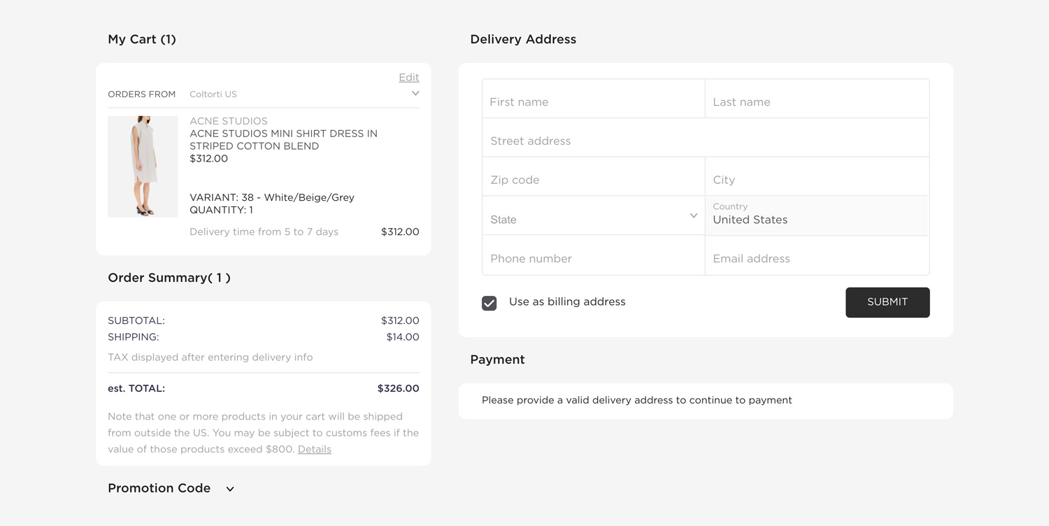
The main element providing the checkout context for all of the checkout modules nested under it.
Modular Checkout is not yet implemented in v4
import {
  ModularCheckout,
  CheckoutCartProducts,
  CheckoutCustomerAddressDelivery,
  CheckoutPayment,
  CheckoutOrderProcessing,
  CheckoutOrderConfirmation,
} from "@tipser/tipser-elements";

//...

<ModularCheckout>
  <ModularCheckout.New>
    <CheckoutCartProducts />
    <CheckoutCustomerAddressDelivery />
    <CheckoutPayment />
  </ModularCheckout.New>

[block:parameters]
{
  "data": {},
  "cols": 3,
  "rows": 1
}
[/block]

  <ModularCheckout.Processing>
    <CheckoutOrderProcessing />
  </ModularCheckout.Processing>

  <ModularCheckout.Empty>
    <div>Your cart is empty!</div>
  </ModularCheckout.Empty>

  <ModularCheckout.Confirmed>
    <CheckoutOrderConfirmation />
  </ModularCheckout.Confirmed>
</ModularCheckout>
This checkout option is highly customizable.

The following sections are supported modules that can be nested under ModularCheckout:
CheckoutProductList
A list of items in the current checkout.
Properties:
| name | description | type | required | default |
|---|---|---|---|---|
| className | custom CSS class name to apply | string | false | none |
CheckoutCustomerAddressDelivery
A form accepting user’s delivery address
This component is only available for integrations using Stripe as the payment provider. In case of Klarna,
CheckoutPaymentcontains its own fields for entering delivery and billing address.
Properties:
| name | description | type | required | default |
|---|---|---|---|---|
| hideUseAsBillingAddressCheckbox | hides the checkbox allowing to copy delivery address as billing address | boolean | false | false |
| submitBehavior | the behaviour of the form after submitting it | 'collapse' or 'none' | false | 'none' |
| hideSubmitButton | hides the "submit" button that collapses the form after filling it with correct data | boolean | false | false |
| className | custom CSS class name to apply | string | false | none |
CSS class overrides:
| CSS Class name | Parent Element | Conditions |
|---|---|---|
te-error | form input wrapper | appended when there are validation errors |
te-error-required | form input wrapper | appended with te-error if a required field is missing |
CheckoutCustomerAddressBilling
A form accepting user’s billing address
This component is only available for integrations using Stripe as the payment provider. In case of Klarna,
CheckoutPaymentcontains its own fields for entering delivery and billing address.
Properties:
| name | description | type | values | required | default |
|---|---|---|---|---|---|
| submitBehavior | the behaviour of the form after submitting it | enum | 'collapse', 'none' | false | none |
| hideSubmitButton | hides the "submit" button that collapses the form after filling it with correct data | boolean | false | false | |
| submitBehavior | the behavior of the form after submitting it | string | 'collapse', 'none' | false | 'collapse' |
| className | custom CSS class name to apply | string | false | none |
CSS class overrides:
| CSS Class Name | Parent Element | Condition |
|---|---|---|
te-error | form input wrapper | appended when there are validation errors |
te-error-required | form input wrapper | appended with te-error if a required field is missing |
CheckoutSummary
A summary of the total costs and taxes resulting from the checkout
Properties:
| name | description | type | required | default |
|---|---|---|---|---|
| className | custom CSS class name to apply | string | false | none |
On the US market the taxes will be calculated only after delivery address is filled.
A payment section, accepting user's payment input (e.g. credit card number). In case of Klarna integrations, this component will additionally contain delivery and billing address forms.
Properties:
| name | description | type | values | required | default |
|---|---|---|---|---|---|
| hidePayButton | hides the "pay" button in Stripe payment provider form | boolean | false | false | |
| dependsOn | lets you render the component depending on the delivery form being valid | string | 'none', 'validDeliveryAddress' | false | 'none' |
| className | custom CSS class name to apply | string | false | none |
CheckoutCartPromoCode
A widget for entering promotion codes
Properties:
| name | description | type | required | default |
|---|---|---|---|---|
| className | custom CSS class name to apply | string | false | none |
CheckoutLegal
A text explaining legal terms of the purchase
Properties:
| name | description | type | required | default |
|---|---|---|---|---|
| className | custom CSS class name to apply | string | false | none |
CheckoutOrderProcessing
A loading animation for checkout processing
Properties:
| name | description | type | required | default |
|---|---|---|---|---|
| className | custom CSS class name to apply | string | false | none |
CheckoutOrderConfirmation
A confirmation page displaying a summary of the completed order
Properties:
| name | description | type | required | default |
|---|---|---|---|---|
| className | custom CSS class name to apply | string | false | none |
CheckoutPaymentRequestButton
Displays a contextual "express payment" button, giving the user a chance to pay with favourite payment method (e.g Apple Pay or Google Pay).
This component should be used in addition to our standard <CheckoutPayment /> component as a faster and more convenient alternative to pay for the order.
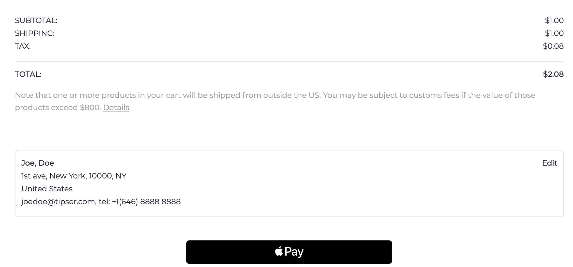
Example of checkout page with Apple Pay button:

Depending on the user's environment, the component will render as either Apple Pay, Google Pay or "pay via browser" button:
- For Safari users with Apple Wallet configured, Apple Pay button will be displayed
- For Chrome users logged on a user account connected to Google Pay, Google Pay button will be displayed
- For users of supported browsers (notably: Chrome, Safari and Edge) with a credit card saved in the browser settings, a browser-specific pay button will be displayed
For environments that are not supporting any express payment options, this component will not be rendered. For this reason, this component is not a full replacement to the
CheckoutPaymentcomponent, just a supplement to it.
This component uses the the Payment Request API to open the dialog window for a given payment method.
Properties:
| name | description | type | required | default |
|---|---|---|---|---|
| dependsOn | should the component only be rendered when the delivery address is submitted? | 'none' or 'validDeliveryAddress' | no | 'none' |
| className | custom CSS class name to apply | string | no | none |
CheckoutPaymentMethodSelector
Displays a fully-featured payment method selector that presents all the payment methods supported by the user's environment (browser, connected wallets, etc).
| Name | Description | Type | Required | Default |
|---|---|---|---|---|
| className | custom CSS class name to apply | string | false | none |
ModularCheckout.Empty, ModularCheckout.New, ModularCheckout.Processing and ModularCheckout.Confirmed
The elements ModularCheckout.Empty, ModularCheckout.New, ModularCheckout.Processing and ModularCheckout.Confirmed are helper elements that are used
to conditionally render their children only for a given checkout status. If none of these elements, will be used, all the elements passed to ModularCheckout
will be rendered for every checkout status.
For example:
<ModularCheckout.Confirmed>
  <CheckoutOrderConfirmation />
</ModularCheckout.Confirmed>
This will guarantee that the CheckoutOrderConfirmation module is only displayed if the current checkout status is confirmed,
that is, that the payment has been successfully processed.
Properties:
No properties supported.
Multi-step ModularCheckout
It is possible to spread the modular checkout over several pages. The only requirement is to keep the Checkout element as a parent for all of the routes
that are using any of the checkout modules described before.
The example below illustrates how to do it with the react-router library.
import React from "react";
import { Checkout, CheckoutProductList, ChekoutCustomerAddressDelivery, CheckoutSummary, CheckoutPromoCode, CheckoutPayment } from "@tipser/tipser-elements";
import { Route, Switch, withRouter } from "react-router";

export const CheckoutMultipage = withRouter(({ match }) => (
  <div>
    <div className="te-multipage-label">Checkout multipage</div>
    <ModularCheckout>
      <Switch>
        <Route path={`${match.url}/step-1`}>
          <CheckoutPage1 />
        </Route>
        <Route path={`${match.url}/step-2`}>
          <CheckoutPage2 />
        </Route>
      </Switch>
    </ModularCheckout>
  </div>
));

const CheckoutPage1 = () => (
  <>
    <h2>Step 1</h2>
    <CheckoutProductList />
    <ChekoutCustomerAddressDelivery />
    <CheckoutSummary />
  </>
);

const CheckoutPage2 = ({ checkout }) => (
  <>
    <h2>Step 2</h2>
    <CheckoutPromoCode />
    <CheckoutPayment />
  </>
);
ModularCart
The main element providing the shopping cart context for all of the shopping cart modules nested under it.
import {
  ModularCart,
  CartProductList,
  CartSummary,
} from "@tipser/tipser-elements";

<ModularCart>
    <CartProductList />
    <CartSummary />
</ModularCart>
A list of supported modules that can be nested under ModularCart:
CartProductList
A list of items in the shopping cart. By default, (unless readOnly prop is set to true) comes together with controls allowing the user to remove products and change their quantities in the shopping cart.
<ModularCart>
  <CartProductList />
</ModularCart>

| Name | Description | Type | Required | Default |
|---|---|---|---|---|
| readOnly | should edit quantity and remove from cart actions be supported? | boolean | no | false |
| disableProductClickAction | should clicking on the product open the product view? | boolean | no | false |
| className | custom CSS class name to apply | string | no | none |
CartSummary
A summary of the total costs and taxes for the products in the shopping cart.
<ModularCart>
  <CartSummary />
</ModularCart>

On the US market the tax value will not be displayed as the tax value can only be calculated at the checkout phase, after the customer fills the delivery address.
| Name | Description | Type | Required | Default |
|---|---|---|---|---|
| className | custom CSS class name to apply | string | false | none |
CartPromoCode
A widget for entering promotion codes
Properties:
| name | description | type | required | default |
|---|---|---|---|---|
| className | custom CSS class name to apply | string | false | none |
CartExpressPayment
Displays a list of supported express payment buttons. Express payment is a way to complete the payment directly from the cart page, skipping the checkout page altogether.
Possible payment buttons: Apple Pay, Google Pay, Pay Pal, Browser Pay.
The exact set of pay buttons displayed to the user will depend on the user's environment (browser, connected wallets, etc).
| Name | Description | Type | Required | Default |
|---|---|---|---|---|
| showSeparator | should the separator with the text "or checkout quickly with" be displayed? | boolean | false | false |
| className | custom CSS class name to apply | string | false | none |
ModularCart.Empty and ModularCart.NonEmpty
ModularCart.Empty and ModularCart.NonEmpty are helper elements that are used to conditionally render their children only for a given shopping cart status. If none of these elements is be used, all the elements passed to ModularCart will be rendered for every shopping cart status.
For example, to provide a custom empty cart information:
<ModularCart>
    <ModularCart.Empty>The shopping cart is empty, please add some products first!</ModularCart.Empty>
    <ModularCart.NonEmpty>
        <CartProductList />
        <CartSummary />
    </ModularCart.NonEmpty>
</ModularCart>
Accessing the cart context
In case you need even more access to the internal functionality of ModularCart, for example in order to build your own shopping cart view implementation, you can use useCartContext hook to access the internal data and functions.
const CustomCartModule = () => {
  const { shoppingCart } = useCartContext();
  useEffect(() => {
    console.log('shoppingCart = ', shoppingCart);
  }, [shoppingCart]);

  return null;
};
Returned members:
| Name | Description |
|---|---|
| shoppingCart | an object with the current state of the shopping cart, including the prices and the list of all cart items (under the items key). |
| changeCartItemQuantity(cartItem, quantity) | a function that can be called with a cart item (taken from the shoppingCart member described above) and a new quantity to update the quantity of the item in the cart. |
| removeCartItem(cartItem) | a function that can be called with a cart item (taken from the shoppingCart member described above) to remove the item from the cart. |
Note that the component using the useCartContext hook needs to be located under the ModularCart component:
const CartWithCustomModule = () => (
<ModularCart>
      <CustomCartModule />
</ModularCart>
)
Internal functions
In case you need to open Tipser dialogs from the code or perform operations like adding a Tipser product to cart, we provide a set of JavaScript functions that serve that purpose.
Typical use case for calling the actions described here is when you want to build your own implementation of some of the components, e.g. the product tile component or the cart icon component.
All the below functions are accessible from useInternalFunctions hook to every component living in the context of TipserElementsProvider.
const { goToProduct, goToCheckout, addToCart, removeFromCart, addToCartAndGoToCheckout } = useInternalFunctions();
goToProduct() function
const { goToProduct } = useInternalFunctions();
goToProduct(productId);
Opens the product modal dialog for a product with a given Tipser product id. Alternatively, redirects to the URL defined in customUrls.baseProductUrl configuration option if specified.
goToCheckout() function
const { goToCheckout } = useInternalFunctions();
goToCheckout();
Opens the checkout modal dialog. Alternatively, redirects to the URL defined in customUrls.checkoutUrl configuration option if specified.
addToCart(productId) function
const { addToCart } = useInternalFunctions();
addToCart(productId).then(() => {
  console.log("adding to cart successful");
}).catch((e) => {
  console.log("adding to cart failed", e)
});
Adds to cart a product with a given Tipser product id. Return a promise
removeFromCart(productId) function
const { removeFromCart } = useInternalFunctions();
removeFromCart(productId).then(() => {
    console.log("removing from cart successful");
}).catch((e) => {
    console.log("removing from cart failed", e)
});
Adds to cart a product with a given Tipser product id. Returns a promise that will succeed or reject depending on the status of that operation.
getCartItems() function
const { getCartItems } = useInternalFunctions();
getCartItems().then((cartItems) => {
    console.log("cart items: ", cartItems)
}).catch((e) => {
    console.log("failed to get cart items", e)
});
Returns a Promise that will eventually return a list of all Tipser products currently in the shopping cart.
addToCartAndGoToCheckout(productId) function
const { addToCartAndGoToCheckout } = useInternalFunctions();
addToCartAndGoToCheckout(productId).then(() => {
   console.log("add to cart and go to checkout successful");
}).catch((e) => {
   console.log("add to cart and go to checkout  failed", e)
});
Adds to cart a product with a given Tipser product id and then opens the checkout modal dialog. Alternatively, redirects to the URL defined in customUrls.checkoutUrl configuration option if specified. Returns a promise that will succeed or reject depending on the status of that operation.
Updated over 1 year ago