Components
TipserElementsProvider
The entry point to Tipser Elements (providing a context for other elements living inside it). Every other element documented here needs to be located below TipserElementsProvider in the React elements hierarchy.
| name | description | type | required | default |
|---|---|---|---|---|
| posId | your unique identifier as a Tipser customer | string | true | none |
| config | the configuration options customising the behaviour of Tipser Elements (read more here) | object | false | default values of all the configuration options |
| history | A browser history implementation specific for your web framework. We recommend providing it in order to use "soft redirects" instead of full page reloads (e.g. when following the links configured in the customUrls object) | An object providing at least the push method which accepts a path parameter of type string and soft-redirects to that path. | window.history |
ProductTile
Displays a tile for the product specified by the productId prop. When the user clicks anywhere on the product tile (not necessarily on the button), the product details are presented.
Example:
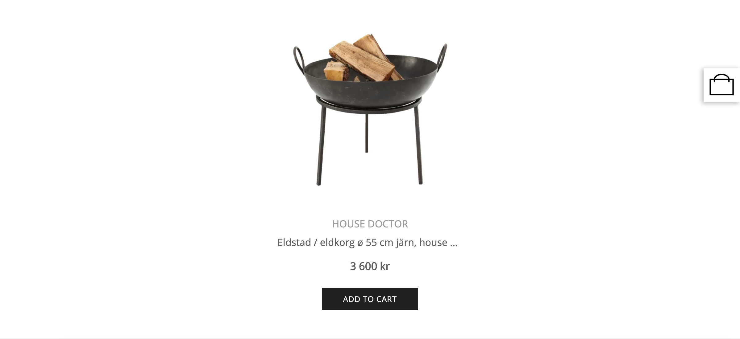
<ProductTile productId="5c751cf82d3f3b0001bcec8c" />
Properties:
| name | description | type | required | default |
|---|---|---|---|---|
| productId | Tipser product id (where to find ) | string | true | none |
| orientation | image and product details alignment | 'horizontal' or 'vertical' | false | vertical |
| size | the size of the product tile | 'small', 'medium' or 'large' | false | 'medium' |
| onProductClick | a callback called when the product is clicked (Tipser's product object is passed as the only argument) | function | false | none |
| className | a custom CSS class name to apply | string | false | none |
Product Detail Page
A larger, more detailed and better exposed product view, typically occupying the full width of the article. Allows the user to add the product to cart without opening the product dialog (which means less steps needed by the user to purchase the product). For products with variants, a variant selector is displayed, letting the user pick the variant before adding to cart.
Example:
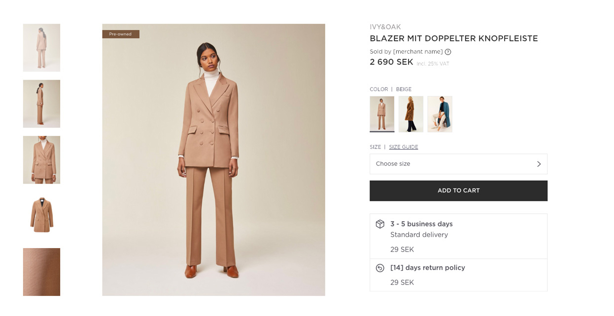
<ProductListing productId="5c751cf82d3f3b0001bcec8c" />
Properties:
| name | description | type | required | default |
|---|---|---|---|---|
| productId | Tipser product id | string | true | none |
| className | a custom CSS class name to apply | string | false | none |
Collection
Renders a collection of product tiles based on collectionId prop.
For large collections you may want to display them as carousels, by adding a carousel prop. You can also use imgSize prop to control the size of displayed product tiles.
example:
<Collection
  collectionId={"5b2788909d25801adcb23f4f"}
  carousel
  imgSize={"small"}
/>
Properties:
| name | description | type | required | default |
|---|---|---|---|---|
| collectionId | where to find | string | true | none |
| carousel | enables carousel display mode | boolean | false | false |
| imgSize | changes the size of single product tile | 'small', 'medium' or 'large' | false | 'medium' |
| className | a custom CSS class name to apply | string | false | none |
CartIcon
A cart icon element that displays the number of items in your cart and brings the user to the checkout when clicked (either by opening the checkout dialog or by redirecting to the checkout embedded page).
Store
A component displaying of all your store collections with the store menu and the active collection. We recommend using it on a dedicated subpage on your site.
import { Store } from '@tipser/tipser-elements';

<Store />
Store menu display
You can choose between two ways of displaying the store menu on the mobile screens. The default one is a native dropdown. If you prefer to use the inline menu instead (the same one as is displayed on other screen sizes), set the inlineMobileMenu prop to true.
Updating the browser's URL
By default, the Store component saves the active collection in the browser's URL hash part (everything after the # symbol in the URL). It allows the users to bookmark the store page or share the URL with others (the same collection will be active in the store when opening the link). To opt-out of this behaviour (e.g. because it interferes with the routing system of your site), set the disableDeepLinking prop to true.
When the active store category is changed, the
Storecomponent is updating the top-level page URL (unlessdisableDeepLinkingprop is set totrue). For this reason, please make sure that it doesn't interfere with the routing system of your your web framework. For the same reason, it's not recommended to include more than oneStoreon a single page.
Supported props
| name | description | type | required | default |
|---|---|---|---|---|
| className | custom CSS class name to apply | string | false | none |
| inlineMobileMenu | should the menu be displayed inline on the mobile breakpoint instead of in a dropdown? | boolean | false | false |
| disableDeepLinking | should reflecting the active collection in the hash part of the URL be disabled? | boolean | false | false |
ProductPage
A full-sized product component to be used on a dedicated page.
<ProductPage productId="5c751cf82d3f3b0001bcec8c">
Example:
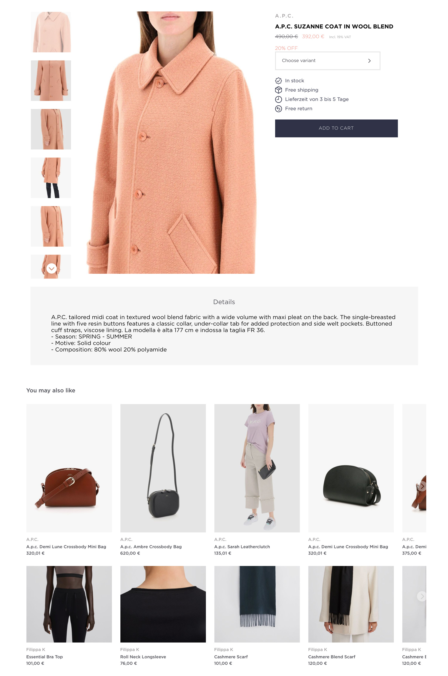
This component renders the same product view that is displayed inside the product modal.
Properties:
| name | description | type | required | default |
|---|---|---|---|---|
| productId | the Tipser id of the product to render | string | true | none |
| className | a custom CSS class name to apply | string | false | none |
CheckoutPage
Our standard checkout component with all necessary elements (product list, user address form, payment widget, etc) to make the purchase possible.
import { CheckoutPage } from '@tipser/tipser-elements';
// ...
<CheckoutPage />
The visual appearance of our standard checkout varies by locale—we've researched how to optimise checkout for your shoppers and have proven data that informs these user interface differences.
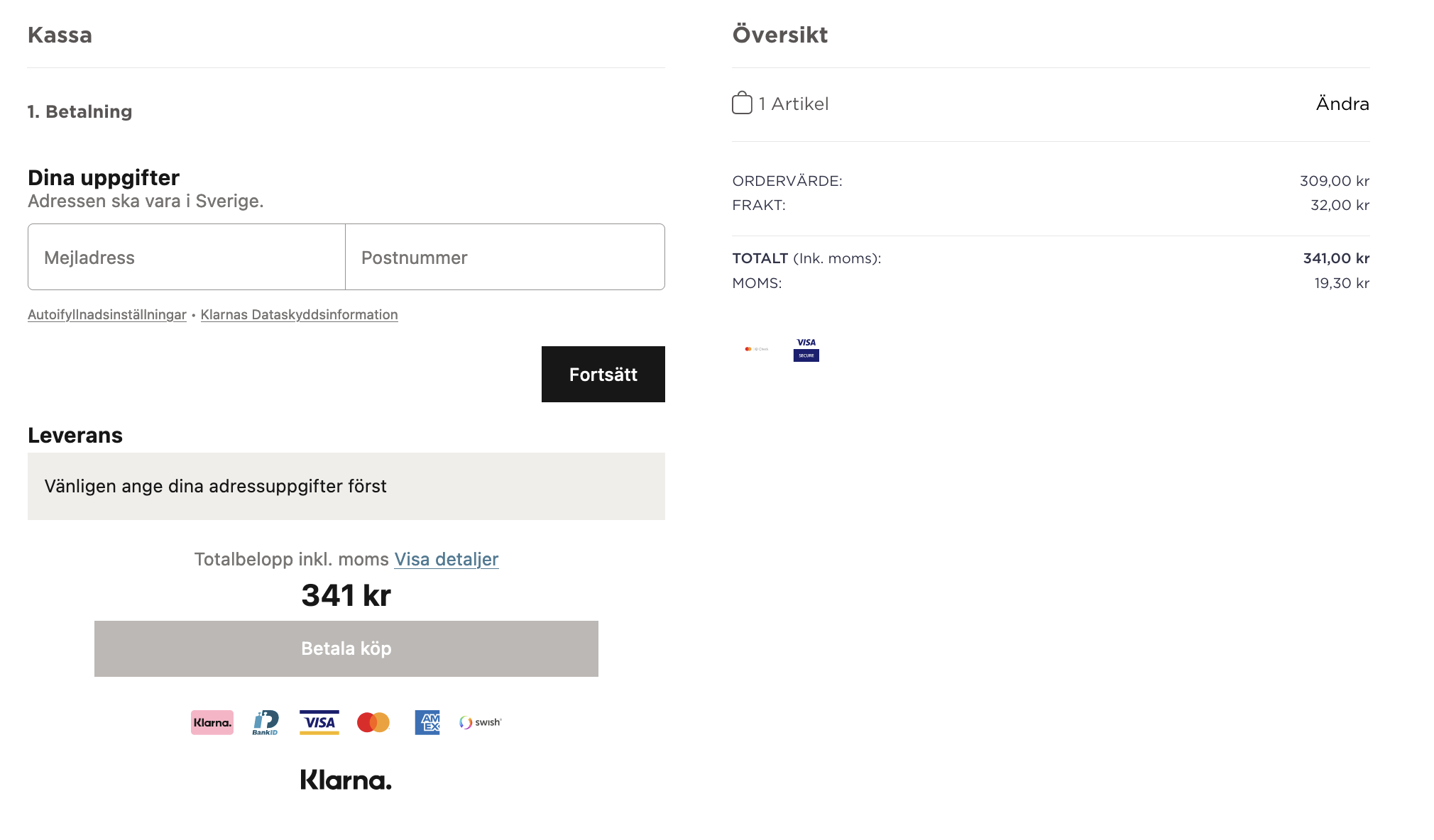
Example of Tipser standard checkout page localized for Sweden
Properties:
| name | description | type | required | default |
|---|---|---|---|---|
| className | custom CSS class name to apply | string | false | none |
If you need more flexibility, use the ModularCheckout component instead.
CartPage
A default implementation of the "review your cart" page.
import { CartPage } from '@tipser/tipser-elements';

<CartPage />
Example:
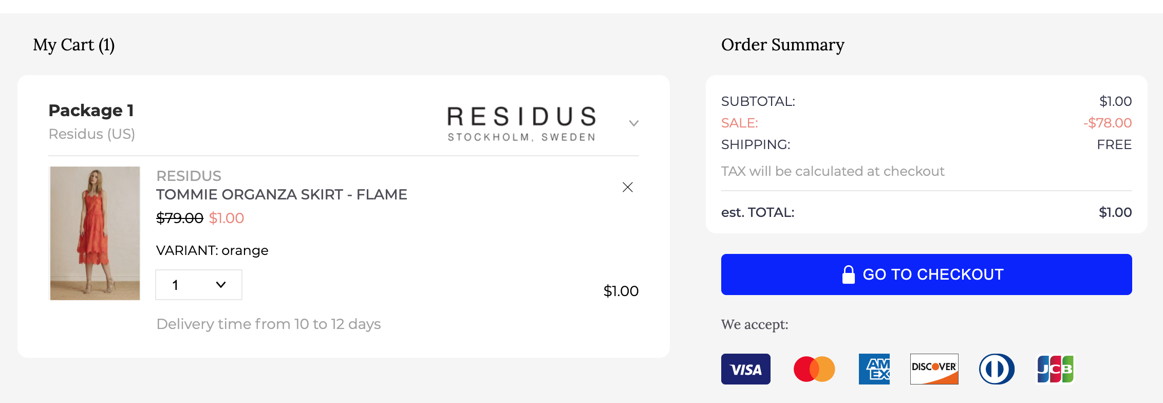
The typical use case for the CartPage component is to use it on an embedded cart page which is a step that precedes the checkout page in the user checkout funnel. This component provides a reasonable default implementation for this step (the same implementation is used in the default cart view that is displayed in a dialog for publishers who don't use the embedded pages). If this implementation is too limiting, you can use the ModularCart component instead.
| name | description | type | required | default |
|---|---|---|---|---|
| className | a custom CSS class name to apply | string | false | none |
ProductList
A list of products, looking the same as Collection component, but instead of the collectionId, you need to pass the array of productIds. and optional carousel and imgSize attributes.
example:
<ProductList
  productIds={[
    "5911c26c8aa0ce3d70cd607b",
    "5c878cc5a6e96d00012e1771",
    "5c878cc5a6e96d00012e1775",
  ]}
/>
| name | description | type | required | default |
|---|---|---|---|---|
| productIds | array of single productIds | array of strings | true | none |
| carousel | enables carousel display | boolean | false | false |
| imgSize | changes the size of single product tile | string ('small', 'medium' or 'large') | false | none |
ModularProduct
ModularProduct component allows you to mix and match the elements that are included in your product view.
In other words, you can build you own version of product view from the existing components like from Lego pieces. And you can even mix in your own components in between.
To be used if more flexibility is needed than what is provided by ProductTile, ProductListing and ProductPage components.
A minimal working example:
<ModularProduct>
    <ProductTitle />
    <ProductPrice />
    <ProductImage />
    <ProductVariantSelector />
    <ProductBuyButton />
</ModularProduct>
And a more sophisticated one:
<ModularProduct productId="5c751cf82d3f3b0001bcec8c">
  <div className="top-container">
    <div className="left-column">
      <ProductThumbnails direction="vertical" />
      <ProductImage />
    </div>
    <div className="right-column">
      <ProductTitle />
      <ProductPrice />
      <ProductColorRelations />
      <ProductVariantSelector />
      <ProductAvailabilityInfo />
      <ProductBuyButton />
    </div>
  </div>
  <div className="bottom-container">
    <ProductDescription />
    <ProductSimilarProducts />
    <ProductStyleWithProducts />
  </div>
</ModularProduct>
Properties:
| name | description | type | required | default |
|---|---|---|---|---|
| productId | the Tipser id of the product to render | string | true | none |
| className | a custom CSS class name to apply | string | false | none |
All the product modules must be located under
ModularProductin the elements hierarchy.
ProductContainer
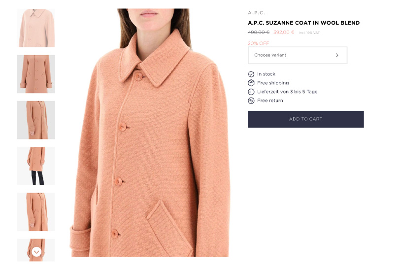
The default implementation of the main part of the product view, consisting of ProductImage, ProductTitle, ProductColorRelations, ProductVariantSelector, ProductAvailabilityInfo and ProductBuyButton.
It may come handy if you don't want to mess with the main part of the product view and just need to customize the remaining sections.
<ModularProduct productId="5c751cf82d3f3b0001bcec8c">
  <ProductContainer />
  <ProductStyleWithProducts />
  <ProductDescription />
  <ProductSimilarProducts />
</ModularProduct>
ProductTitle
Displays the name and the brand of the product.
<ModularProduct productId="5c751cf82d3f3b0001bcec8c">
  <ProductTitle />
</ModularProduct>

ProductPrice
Displays the price, discount price and unit price ( eg. 2$/100ml, if applicable ) for the product.
<ModularProduct productId="5c751cf82d3f3b0001bcec8c">
  <ProductPrice />
</ModularProduct>

ProductImage
Displays the full-size version of the active product image. With some configuration options it can be also used to change the active product image.
ProductImagecomponent must be placed in a container with fixed width and height and it will grow to fill that container.
<ModularProduct productId="5c751cf82d3f3b0001bcec8c">
  <div>
    <ProductImage enableDots enableArrows />
  </div>
</ModularProduct>
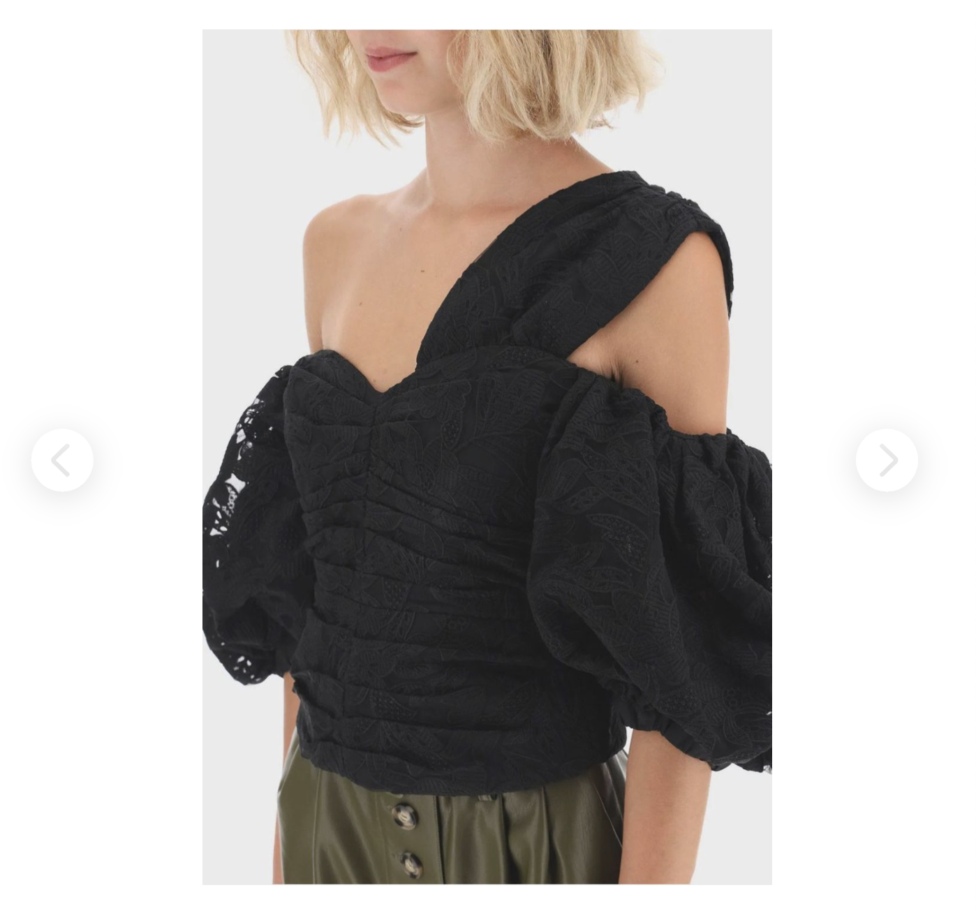
| name | type | description | default |
|---|---|---|---|
| enableSwipe | boolean | enables swipe functionality (recommended for touch devices) | false |
| enableArrows | boolean | show left and right arrows for changing images | false |
| enableDots | boolean | show slider bullet dots | false |
| className | string | custom CSS class name to apply | none |
ProductThumbnails
Displays the product thumbnails.
ProductThumbnailscomponent must be placed in a container with fixed width and height and it will grow to fill that container.
<ModularProduct productId="5c751cf82d3f3b0001bcec8c">
  <div>
    <ProductThumbnails />
  </div>
</ModularProduct>

In the horizontal mode thumbnails will always expand to 100% of the width and height to its parent container and automatically adjust the number of displaying thumbnails depending on the width, height and ratio of its parent container.
| name | type | description | default |
|---|---|---|---|
| imageFit | 'contain' | 'cover' | changes the background-size property | 'cover' |
| direction | 'vertical' | 'horizontal' | changes the orientation of the thumbnails container | 'horizontal' |
| className | string | custom CSS class name to apply | none |

In the vertical mode a single thumbnail will always have a fixed width of 100px, so to change the number of the thumbnails you should change only the height of its parent container.
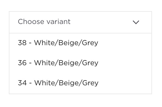
ProductVariantSelector
A dropdown listing all variants of the product. When a variant is selected from the list, all the displayed product information will be updated accordingly (only available variants are selectable).
<ModularProduct productId="5c751cf82d3f3b0001bcec8c">
  <ProductVariantSelector />
</ModularProduct>
ProductAvailabilityInfo
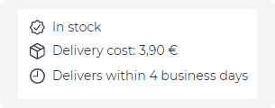
Displays information related to product availability and delivery, such as:
- product availability
- delivery cost
- delivery time
<ModularProduct productId="5c751cf82d3f3b0001bcec8c">
  <ProductAvailabilityInfo />
</ModularProduct>
ProductDescription
Displays the product text description.
<ModularProduct productId="5c751cf82d3f3b0001bcec8c">
  <ProductDescription />
</ModularProduct>

ProductBuyButton
A button adding the product to the shopping cart.
<ModularProduct productId="5c751cf82d3f3b0001bcec8c">
  <ProductBuyButton />
</ModularProduct>

In case the variant has not been yet selected, clicking the button will expand the variant selector instead.
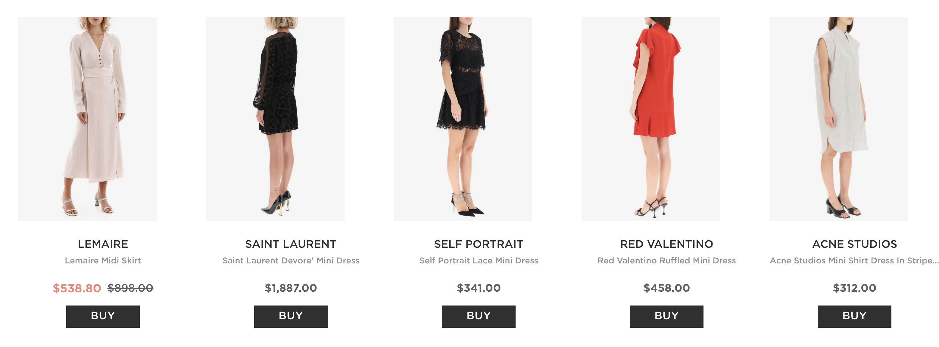
ProductSimilarProducts
An automatically generated list of similar products (basing on text similarity, image similarity, more from the same brand, etc).
<ModularProduct productId="5c751cf82d3f3b0001bcec8c">
  <ProductSimilarProducts />
</ModularProduct>
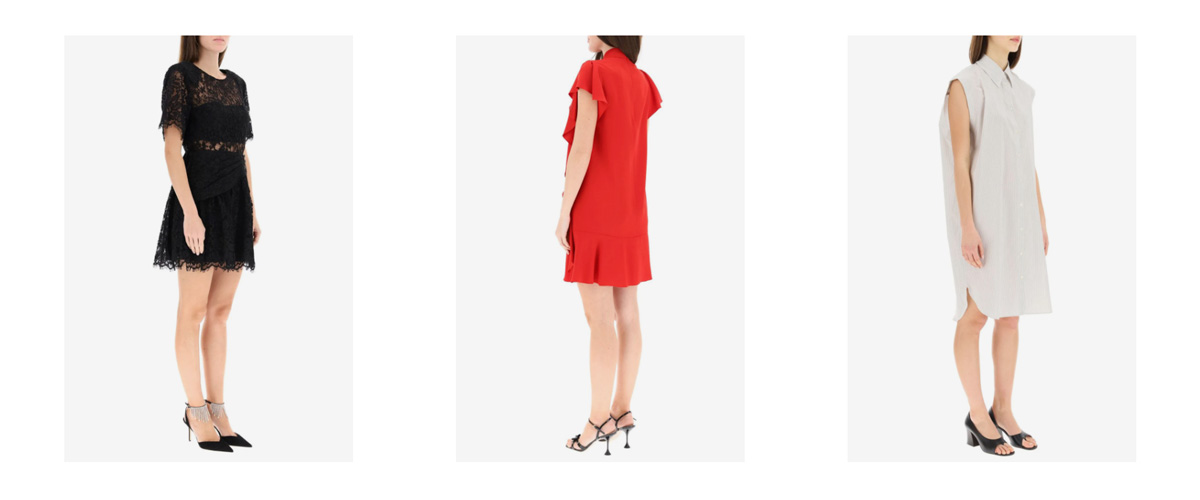
ProductColorRelations
Displays the list of color variants of the product and switches the product view to any of them, when clicked.
<ModularProduct productId="5c751cf82d3f3b0001bcec8c">
  <ProductColorRelations />
</ModularProduct>
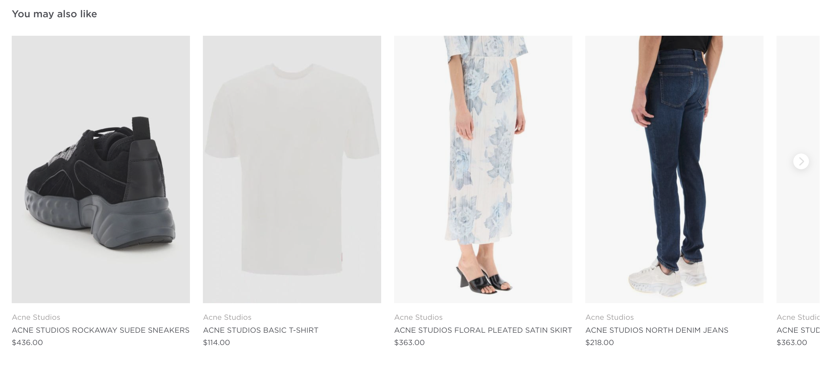
ProductStyleWithProducts
A hand-picked list of other products that go well together with the current product.
<ModularProduct productId="5c751cf82d3f3b0001bcec8c">
  <ProductStyleWithProducts />
</ModularProduct>
Modular Checkout
The main element providing the checkout context for all of the checkout modules nested under it.
Modular Checkout is not yet implemented in v4
import {
  ModularCheckout,
  CheckoutCartProducts,
  CheckoutCustomerAddressDelivery,
  CheckoutPayment,
  CheckoutOrderProcessing,
  CheckoutOrderConfirmation,
} from "@tipser/tipser-elements";

//...

<ModularCheckout>
  <ModularCheckout.New>
    <CheckoutCartProducts />
    <CheckoutCustomerAddressDelivery />
    <CheckoutPayment />
  </ModularCheckout.New>

  <ModularCheckout.Processing>
    <CheckoutOrderProcessing />
  </ModularCheckout.Processing>

  <ModularCheckout.Empty>
    <div>Your cart is empty!</div>
  </ModularCheckout.Empty>

  <ModularCheckout.Confirmed>
    <CheckoutOrderConfirmation />
  </ModularCheckout.Confirmed>
</ModularCheckout>
This checkout option is highly customizable.
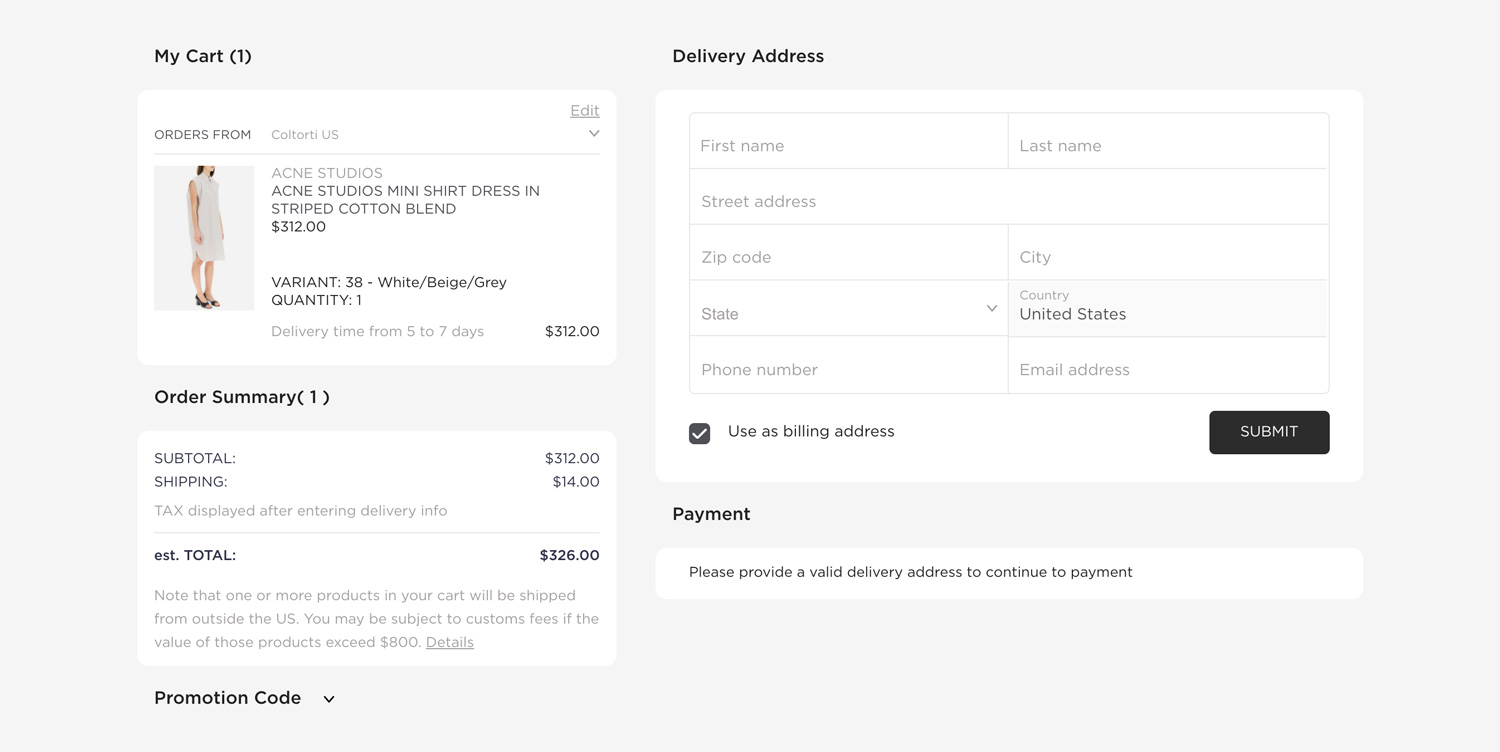
Example of a checkout experience created with Tipser elements
The following sections are supported modules that can be nested under ModularCheckout:
CheckoutProductList
A list of items in the current checkout.
Properties:
| name | description | type | required | default |
|---|---|---|---|---|
| className | custom CSS class name to apply | string | false | none |
CheckoutCustomerAddressDelivery
A form accepting user’s delivery address
This component is only available for integrations using Stripe as the payment provider. In case of Klarna,
CheckoutPaymentcontains its own fields for entering delivery and billing address.
Properties:
| name | description | type | required | default |
|---|---|---|---|---|
| hideUseAsBillingAddressCheckbox | hides the checkbox allowing to copy delivery address as billing address | boolean | false | false |
| submitBehavior | the behaviour of the form after submitting it | 'collapse' or 'none' | false | 'none' |
| hideSubmitButton | hides the "submit" button that collapses the form after filling it with correct data | boolean | false | false |
| className | custom CSS class name to apply | string | false | none |
CSS class overrides:
| CSS Class Name | Parent Element | Conditions |
|---|---|---|
te-error | form input wrapper | appended when there are validation errors |
te-error-required | form input wrapper | appended with te-error if a required field is missing |
CheckoutCustomerAddressBilling
A form accepting user’s billing address
This component is only available for integrations using Stripe as the payment provider. In case of Klarna,
CheckoutPaymentcontains its own fields for entering delivery and billing address.
Properties:
| name | description | type | values | required | default |
|---|---|---|---|---|---|
| submitBehavior | the behaviour of the form after submitting it | enum | 'collapse', 'none' | false | none |
| hideSubmitButton | hides the "submit" button that collapses the form after filling it with correct data | boolean | false | false | |
| submitBehavior | the behavior of the form after submitting it | string | 'collapse', 'none' | false | 'collapse' |
| className | custom CSS class name to apply | string | false | none |
CSS class overrides:
| CSS Class Name | Parent Element | Condition |
|---|---|---|
te-error | form input wrapper | appended when there are validation errors |
te-error-required | form input wrapper | appended with te-error if a required field is missing |
CheckoutSummary
A summary of the total costs and taxes resulting from the checkout
Properties:
| name | description | type | required | default |
|---|---|---|---|---|
| className | custom CSS class name to apply | string | false | none |
On the US market the taxes will be calculated only after delivery address is filled.
A payment section, accepting user's payment input (e.g. credit card number). In case of Klarna integrations, this component will additionally contain delivery and billing address forms.
Properties:
| name | description | type | values | required | default |
|---|---|---|---|---|---|
| hidePayButton | hides the "pay" button in Stripe payment provider form | boolean | false | false | |
| dependsOn | lets you render the component depending on the delivery form being valid | string | 'none', 'validDeliveryAddress' | false | 'none' |
| className | custom CSS class name to apply | string | false | none |
CheckoutCartPromoCode
A widget for entering promotion codes
Properties:
| name | description | type | required | default |
|---|---|---|---|---|
| className | custom CSS class name to apply | string | false | none |
CheckoutLegal
A text explaining legal terms of the purchase
Properties:
| name | description | type | required | default |
|---|---|---|---|---|
| className | custom CSS class name to apply | string | false | none |
CheckoutOrderProcessing
A loading animation for checkout processing
Properties:
| name | description | type | required | default |
|---|---|---|---|---|
| className | custom CSS class name to apply | string | false | none |
CheckoutOrderConfirmation
A confirmation page displaying a summary of the completed order
Properties:
| name | description | type | required | default |
|---|---|---|---|---|
| className | custom CSS class name to apply | string | false | none |
CheckoutPaymentRequestButton
Displays a contextual "express payment" button, giving the user a chance to pay with favourite payment method (e.g Apple Pay or Google Pay).
This component should be used in addition to our standard <CheckoutPayment /> component as a faster and more convenient alternative to pay for the order.
Example of checkout page with Apple Pay button:
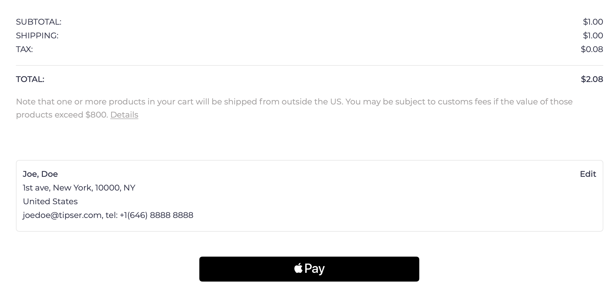
Depending on the user's environment, the component will render as either Apple Pay, Google Pay or "pay via browser" button:
- For Safari users with Apple Wallet configured, Apple Pay button will be displayed
- For Chrome users logged on a user account connected to Google Pay, Google Pay button will be displayed
- For users of supported browsers (notably: Chrome, Safari and Edge) with a credit card saved in the browser settings, a browser-specific pay button will be displayed
For environments that are not supporting any express payment options, this component will not be rendered. For this reason, this component is not a full replacement to the
CheckoutPaymentcomponent, just a supplement to it.
This component uses the the Payment Request API to open the dialog window for a given payment method.
Properties:
| name | description | type | required | default |
|---|---|---|---|---|
| dependsOn | should the component only be rendered when the delivery address is submitted? | 'none' or 'validDeliveryAddress' | no | 'none' |
| className | custom CSS class name to apply | string | no | none |
CheckoutPaymentMethodSelector
Displays a fully-featured payment method selector that presents all the payment methods supported by the user's environment (browser, connected wallets, etc).
| name | description | type | required | default value |
|---|---|---|---|---|
| className | custom CSS class name to apply | string | false | none |
ModularCheckout.Empty, ModularCheckout.New, ModularCheckout.Processing and ModularCheckout.Confirmed
The elements ModularCheckout.Empty, ModularCheckout.New, ModularCheckout.Processing and ModularCheckout.Confirmed are helper elements that are used
to conditionally render their children only for a given checkout status. If none of these elements, will be used, all the elements passed to ModularCheckout
will be rendered for every checkout status.
For example:
<ModularCheckout.Confirmed>
  <CheckoutOrderConfirmation />
</ModularCheckout.Confirmed>
This will guarantee that the CheckoutOrderConfirmation module is only displayed if the current checkout status is confirmed,
that is, that the payment has been successfully processed.
Properties:
No properties supported.
Multi-step ModularCheckout
It is possible to spread the modular checkout over several pages. The only requirement is to keep the Checkout element as a parent for all of the routes
that are using any of the checkout modules described before.
The example below illustrates how to do it with the react-router library.
import React from "react";
import { Checkout, CheckoutProductList, ChekoutCustomerAddressDelivery, CheckoutSummary, CheckoutPromoCode, CheckoutPayment } from "@tipser/tipser-elements";
import { Route, Switch, withRouter } from "react-router";

export const CheckoutMultipage = withRouter(({ match }) => (
  <div>
    <div className="te-multipage-label">Checkout multipage</div>
    <ModularCheckout>
      <Switch>
        <Route path={`${match.url}/step-1`}>
          <CheckoutPage1 />
        </Route>
        <Route path={`${match.url}/step-2`}>
          <CheckoutPage2 />
        </Route>
      </Switch>
    </ModularCheckout>
  </div>
));

const CheckoutPage1 = () => (
  <>
    <h2>Step 1</h2>
    <CheckoutProductList />
    <ChekoutCustomerAddressDelivery />
    <CheckoutSummary />
  </>
);

const CheckoutPage2 = ({ checkout }) => (
  <>
    <h2>Step 2</h2>
    <CheckoutPromoCode />
    <CheckoutPayment />
  </>
);
ModularCart
The main element providing the shopping cart context for all of the shopping cart modules nested under it.
import {
  ModularCart,
  CartProductList,
  CartSummary,
} from "@tipser/tipser-elements";

<ModularCart>
    <CartProductList />
    <CartSummary />
</ModularCart>
A list of supported modules that can be nested under ModularCart:
CartProductList
A list of items in the shopping cart. By default, (unless readOnly prop is set to true) comes together with controls allowing the user to remove products and change their quantities in the shopping cart.
<ModularCart>
  <CartProductList />
</ModularCart>
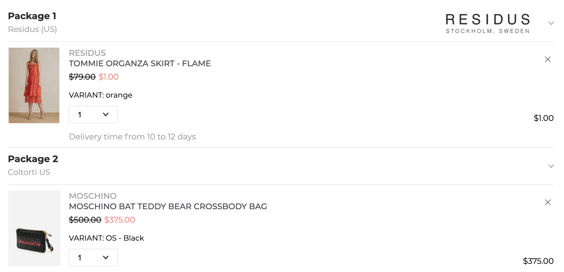
Properties:
| name | description | type | required | default value |
|---|---|---|---|---|
| readOnly | should edit quantity and remove from cart actions be supported? | boolean | no | false |
| disableProductClickAction | should clicking on the product open the product view? | boolean | no | false |
| className | custom CSS class name to apply | string | no | none |
CartSummary
A summary of the total costs and taxes for the products in the shopping cart.
<ModularCart>
  <CartSummary />
</ModularCart>

On the US market the tax value will not be displayed as the tax value can only be calculated at the checkout phase, after the customer fills the delivery address.
Properties:
| name | description | type | required | default |
|---|---|---|---|---|
| className | custom CSS class name to apply | string | false | none |
CartPromoCode
A widget for entering promotion codes
Properties:
| name | description | type | required | default |
|---|---|---|---|---|
| className | custom CSS class name to apply | string | false | none |
CartExpressPayment
Displays a list of supported express payment buttons. Express payment is a way to complete the payment directly from the cart page, skipping the checkout page altogether.
Possible payment buttons: Apple Pay, Google Pay, Pay Pal, Browser Pay.
The exact set of pay buttons displayed to the user will depend on the user's environment (browser, connected wallets, etc).
| name | description | type | required | default value |
|---|---|---|---|---|
| showSeparator | should the separator with the text "or checkout quickly with" be displayed? | boolean | false | false |
| className | custom CSS class name to apply | string | false | none |
ModularCart.Empty and ModularCart.NonEmpty
ModularCart.Empty and ModularCart.NonEmpty are helper elements that are used to conditionally render their children only for a given shopping cart status. If none of these elements is be used, all the elements passed to ModularCart will be rendered for every shopping cart status.
For example, to provide a custom empty cart information:
<ModularCart>
    <ModularCart.Empty>The shopping cart is empty, please add some products first!</ModularCart.Empty>
    <ModularCart.NonEmpty>
        <CartProductList />
        <CartSummary />
    </ModularCart.NonEmpty>
</ModularCart>
Accessing the cart context
In case you need even more access to the internal functionality of ModularCart, for example in order to build your own shopping cart view implementation, you can use useCartContext hook to access the internal data and functions.
const CustomCartModule = () => {
  const { shoppingCart } = useCartContext();
  useEffect(() => {
    console.log('shoppingCart = ', shoppingCart);
  }, [shoppingCart]);

  return null;
};
Returned members:
| Name | Description |
|---|---|
| shoppingCart | an object with the current state of the shopping cart, including the prices and the list of all cart items (under the items key). |
| changeCartItemQuantity(cartItem, quantity) | a function that can be called with a cart item (taken from the shoppingCart member described above) and a new quantity to update the quantity of the item in the cart. |
| removeCartItem(cartItem) | a function that can be called with a cart item (taken from the shoppingCart member described above) to remove the item from the cart. |
Note that the component using the useCartContext hook needs to be located under the ModularCart component:
const CartWithCustomModule = () => (
<ModularCart>
      <CustomCartModule />
</ModularCart>
)
Internal functions
In case you need to open Tipser dialogs from the code or perform operations like adding a Tipser product to cart, we provide a set of JavaScript functions that serve that purpose.
Typical use case for calling the actions described here is when you want to build your own implementation of some of the components, e.g. the product tile component or the cart icon component.
All the below functions are accessible from useInternalFunctions hook to every component living in the context of TipserElementsProvider.
const { goToProduct, goToCheckout, addToCart, removeFromCart, addToCartAndGoToCheckout } = useInternalFunctions();
goToProduct() function
const { goToProduct } = useInternalFunctions();
goToProduct(productId);
Opens the product modal dialog for a product with a given Tipser product id. Alternatively, redirects to the URL defined in customUrls.baseProductUrl configuration option if specified.
goToCheckout() function
const { goToCheckout } = useInternalFunctions();
goToCheckout();
Opens the checkout modal dialog. Alternatively, redirects to the URL defined in customUrls.checkoutUrl configuration option if specified.
addToCart(productId) function
const { addToCart } = useInternalFunctions();
addToCart(productId).then(() => {
  console.log("adding to cart successful");
}).catch((e) => {
  console.log("adding to cart failed", e)
});
Adds to cart a product with a given Tipser product id. Return a promise
removeFromCart(productId) function
const { removeFromCart } = useInternalFunctions();
removeFromCart(productId).then(() => {
    console.log("removing from cart successful");
}).catch((e) => {
    console.log("removing from cart failed", e)
});
Adds to cart a product with a given Tipser product id. Returns a promise that will succeed or reject depending on the status of that operation.
getCartItems() function
const { getCartItems } = useInternalFunctions();
getCartItems().then((cartItems) => {
    console.log("cart items: ", cartItems)
}).catch((e) => {
    console.log("failed to get cart items", e)
});
Returns a Promise that will eventually return a list of all Tipser products currently in the shopping cart.
addToCartAndGoToCheckout(productId) function
const { addToCartAndGoToCheckout } = useInternalFunctions();
addToCartAndGoToCheckout(productId).then(() => {
   console.log("add to cart and go to checkout successful");
}).catch((e) => {
   console.log("add to cart and go to checkout  failed", e)
});
Adds to cart a product with a given Tipser product id and then opens the checkout modal dialog. Alternatively, redirects to the URL defined in customUrls.checkoutUrl configuration option if specified. Returns a promise that will succeed or reject depending on the status of that operation.
Updated over 1 year ago