Configuration
The configuration object can be passed to the config prop of TipserElementsProvider.
const tipserConfig = {primaryColor: "#222"};

return <TipserElementsProvider posId={POS_ID} config={tipserConfig}>
  //put your implementation here
</TipserElementsProvider>
Below is an example demonstrating the use of most of the available configuration options:
const tipserConfig = {
  primaryColor: "#0000FF",
  env: "dev",
  lang: 'en-US',
  addToCartSettings: {
      directToCheckoutMode: false,
  },
  customLabels: {
    buy: "buy now!",
    add_to_cart: "add to shopping bag",
    choose_variant: "available variants",
    out_of_stock: "magazine supplies finished",
  },
  posData: {
    key: "value"
  },
  customUrls: {
    productBaseUrl: (productId) => `/product-page?productId=${productId}`,
    checkoutConfirmationUrl: "/checkout-confirmation",
    checkoutUrl: "/checkout",
  },
  prePopulatedAddress: {
      delivery: {
        firstName: 'John',
        lastName: 'Doe',
        email: '[email protected]',
        zipCode: '12345',
        city: 'Ankeborg',
        street: 'Stårgatan 1',
        country: 'Sweden',
        state: '',
        phoneNumber: '0765260000'
      },
      billing: {
        firstName: 'Jane',
        lastName: 'Doe',
        email: '[email protected]',
        zipCode: '12345',
        city: 'Ankeborgen',
        street: 'Stårgatan 1',
        country: 'Sweden',
        state: '',
      },
  },
  modalUi: {
    hideSimilarProducts: true,
  },
  addToCartPopup: {
    className: "custom-className",
    duration: 5000;
  };
}
They will be described in the following sections.
Primary Color
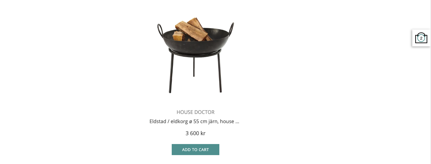
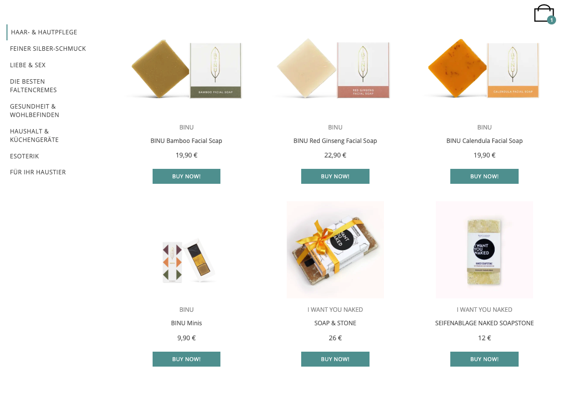
If you'd like to unify our design with your own color-theme, you can use our primary color configuration option to change the color of buy buttons in Product and indicator of items number in Cart. You only need to make sure to use the right hex color code.
const elementsConfig = {primaryColor: "#5F9F9F"};

If your primary color is bright, you may consider changing also the text color for elements like buttons via CSS overrides of element's specific class (examples).
Environment
By default, Tipser Script connects to the production Tipser environment. For the simple integrations with Tipser that run only on the customer-facing page, this is enough. For publishers that have testing / QA versions of their pages, it is recommended to connect their testing environments to Tipser dev environment. That way all the user interactions will be performed on test products / collections and performing a test purchase will be possible (that is a purchase that is not actually charging a real credit card or any other payment method).
Supported values:
| value | description |
|---|---|
| prod | A production environment of Tipser infrastructure. The default value of the env parameter. Please make sure to use this one on your customer-facing page. |
| dev | A dev environment of Tipser infrastructure. Use it only on your testing / QA environments. Use the dev value to connect to the dev database of Tipser products and collections and to enable test payments. |
const elementsConfig = {env: "dev"};
Please note that when using env: 'dev' setting, all the Tipser product ids and Tipser collection ids must be taken from the dev version of Tipser Portal.
Language and locale
lang configuration option specifies the language to be used. Supported languages are currently:
| value | description |
|---|---|
| en-US | English (USA) |
| en-GB | English |
| de-DE | German |
| de-DE-formal | German (Formal) |
| fr-FR | French |
| fi-FI | Finnish |
| sv-SE | Swedish |
const elementsConfig = {lang: 'en-US'};
It affects all the localizable texts in the UI - buy buttons, store, shopping cart and checkout. It does not affect the currency in which the customer will pay for the product.
Direct to checkout mode
When theaddToCartSettings.directToCheckoutMode option is set to true, then after clicking the "add to cart" button the user is moved directly to the cart phase (with the product added to the cart).
Add to cart popup
const elementsConfig = {
  addToCartPopup: {
    className: "custom-className",
    duration: 5000
  }
};
classNameadds a custom class name to the "added to cart" popupdurationthe amount of time (in ms) to keep "added to cart" popup visible
Custom Labels
If you want to override our default text labels with your own, you can do it via customLabels option.
Currently supported options:
const elementsConfig = {
    customLabels: {
      buy: "buy now!", //displated at the button at the bottom of product tile, originally "buy"
      add_to_cart: "add to shopping bag", //displayed at product details, originally "add to cart"
      choose_variant: "available variants", //displayed at product details, originally "choose variant"
      out_of_stock: "sold out", //displayed at product tile and product details for out of stock products, originally "out of stock"
    }
};
Example:

POS data
Go to this section to see the usage.
Custom Urls
To fully embed the Tipser Product Page or the Checkout on your site, please use these configuration options to determine the relative path directing to them.
const elementsConfig = {
    customUrls: {
       productBaseUrl: (productId) => `/product-page?productId=${productId}`,
       checkoutUrl: "/checkout",
       checkoutConfirmationUrl: "/checkout-confirmation",
    }
}
Prepopulated address data
If you would like to use your logged-in User's data to prepopulate address data of the payment provider, you can pass it on via Tipser config prePopulatedAddress option.
const elementsConfig = {
    prePopulatedAddress: {
      delivery: {
        firstName: 'John',
        lastName: 'Doe',
        email: '[email protected]',
        zipCode: '12345',
        city: 'Ankeborg',
        street: 'Stårgatan 1',
        country: 'Sweden',
        state: '',
        phoneNumber: '0765260000'
      },
      billing: {
        firstName: 'Jane',
        lastName: 'Doe',
        email: '[email protected]',
        zipCode: '',
        city: 'Ankeborgen',
        street: 'Stårgatan 1',
        country: 'Sweden',
        state: '',
      },
    },
}
Parameters for modal customization
Hiding the similar products section in the product dialog:
const elementsConfig = {
    modalUi: {
      hideSimilarProducts: true, //by default, the similar products section is visible
    }
};
Enabling styles inheritance:
const tipserScriptConfig = {
    modalUi: {
      inheritStyles: true, //by default, styles are not inherited from the parent page
    }
};
Starting with Tipser Script 3.0 a set of default styles (font-size, font-family, header sizes, etc) is applied inside the Tipser modal (overriding corresponding styles from the parent page). The configuration option above disables the default styles in favour of using the styles inherited from the parent page.
Events Handlers
Custom event handlers can be defined as callback functions specified in the eventsHandlers section of the configuration.
For example:
const tipserScriptConfig = {
    eventsHandlers: {
      onAddToCart: ({product, cartSize, selectedVariant}) => {
         console.log(`Product ${product.title} was added to cart.`);
         console.log(`New product quantity is: ${product.quantity}.`);
         console.log(`New total cart size is: ${cartSize}.`);
      }
    }
};
Supported events:
| name | description |
|---|---|
| onAddToCart({product, cartSize, selectedVariant}) | A callback function called when a product is added to cart |
| onRemoveFromCart({product, cartSize}) | A callback function called when a product is removed from cart |
| onQuantityChange({product, cartSize}) | A callback function called when a product quantity is changed in cart |
| onModalClose() | A callback function called when Tipser modal is closed |
The callback functions accept zero or one parameter. If present, the parameter may have the following members (ES6 object destructuring syntax is recommended to access them, as in the example above):
| name | description |
|---|---|
| product | Which product is the subject of the event. (E.g. what product was added to cart in case of onAddToCart event) |
| cartSize | The new cart size after the event has been resolved. (E.g. the new cart size after the product has been added to cart in case of onAddToCart event) |
| selectedVariant | Which product variant is the subject of the event. (E.g. what product variant was added to cart in case of onAddToCart event) |
Cart icon dropdown
By default when the CartIcon component is clicked, a dropdown displaying the contents of the cart is shown.
If the intended behaviour is to bring the user directly to the checkout page, this can be configured with the following config option:
const tipserConfig = {
  disableCartIconDropdown: false
}
Updated 8 months ago
